Data Catalog for Pharmaceutical Analytics

For a global leading pharmaceutical company
Project Overview
The client’s research & development team suffered from a cumbersome manual process of managing and accessing the complex research data. This data catalog project, STORK, acting as a centralized data repository, created a swift experience of finding, validating, and using research data during collaboration. Features were designed to fit the mentality of pre-clinical/clinical researchers, like heat map view, network view, and compare view. They simplify user interaction with complex research data and increase the team's efficiency ultimately.
My Contributions
UX/UI Designer, 10 weeks (first 6 weeks as a team of 2), 2019
Design review, user interviews, experience mapping, user flow, workshop co-facilitation, usability testings, wireframe & clickable mockup, responsive design, demo, design system
Technical Environment: Sketch App, InVision

Discover & Define

Interviews with users and subject matter experts kicked off our learning of the business process and user needs.
With collected information, we have a better understand of the business process and business needs, and the pain points and needs of users.
Artifacts like persona and business blueprint (think of user journey with extra elements that plays a role during business process) were created to show the current states and inform design opportunities.

All information we gathered shows the problem is the then data finding process was fragmented and manual: researchers have to go through tedious communication w/ bio technician in order to get the right data, verify/examine if data is eligible, and conduct analysis. Users need a one-stop research data catalog that fits researcher’s mindset so they can find and use data with ease, so communication effort could be saved creating a more efficient research process.

So we synthesized the design question:
How might we support pharmaceutical research team to find, validate, and use complex research data?

Design Development

User Journey
We mapped out high level steps of the user journey so we can flesh out the process later. They are:

Plan
For either specific research question or vague exploring direction, the user decides to look into one or multiple data types.

Find
Through filtering, the user gets a list of search results where users will rely on card information or attribute distribution to find data that worthy further attention.

View
By looking at detailed information like collecting methods and standards, the user will judge if this data is viable for the research question or exploration.

Compare
By comparing multiple viable data side by side, the user can decide if multiple data are compatible to be analyzed together for one research.

Use
The user will use selected data to generate simple analysis or download them for offline investigation.
Participatory Design Workshop
To Understand User Mindset
As we learned, researchers have various approaches and strategies when finding data. We want to understand their data-finding mindsets so we collaborated together with 12 researchers(end users) in a 2-hour workshop.

Outcome
• We learned more in-depth details about the user mindset and user scenery from user’s real examples
• Multiple user flow were collected. Two of the flows cover everything in the journey so were used for screen designs later.
• We got buy-in from the end-users, who are highly intelligent and professional in the practice
Wireframe to High Fidelity Screens
White-boarding & Wireframes
Two white-boarding sessions helped us rapidly build up interface ideas. Based on the flow steps, we discussed questions like how we can enable users to set up the filter quickly and how the cards show what relevant information in a way that is easier for browsing.
Specifically built upon the two workshop use cases, the wireframes included experiences from the "Find" step to the "Use" step. We experimented with options that we ideated and made initial iterations collaborating with the business team. Finally, the wireframe was turned into a clickable InVision prototype setting up for the usability testings.

Design Highlights

Network View
A dedicated area on the left side allows users to add a quick filter or a custom filter. It creates a flexible and easy filtering approach, even though users interact with many searchable attributes. The list on the right side shows data cards that satisfy the search criteria.

Heat Map
Users can switch the cards view to a heat map view, where they can see the search results distributed on dimensions like assay, tumor type, or genes. Users commonly need aggregating more information to support their research, and this heat map helps users to visually find out if a particular type of data is associated with more research. In reverse, this heat map also helps to spot if the catalog lacks a certain kind of data that the inventory needs.

Filter Area
Network ViewThe network view shows the relationships within the attributes of search results. It enables users to freely explore the related data by following the thread of connection.

Comparison View
Users can launch this comparison view from the interface floating at the screen bottom. Users have a side-by-side comparison view of selected data. The information and layout aim to help users decide the viability to use these data together.

Choose Analysis
Users can select an analysis that compatible with selected data files.

Deliver

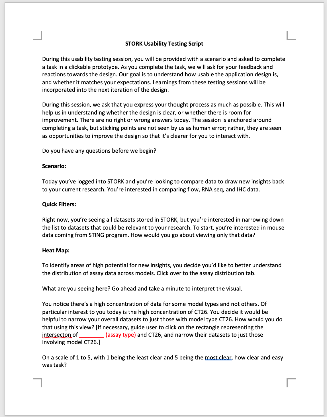
Usability Testings
6 Users, 30-min Session
In the usability testings using clickable wireframe, we set up a specific scenario to guide users to finish use tasks. By observing users' reaction and getting feedback, we think received a positive response. We also got useful feedbacks for improvements, like:
- Making the comparison interface more straightforward for users to spot shared attributes.
- Adding an expanded version for the heat map view.

Visual & Responsive Design
Marrying Client's Brand with Material Design
Considering the limited implementation scope, we leveraged on Material Design to create the interface, considering to the foundation and the faster development using Angular.js.
Our client has a beautiful brand design and a clarified branding guideline. We decided to blend the visuals from the brand identity, and also to follow the guidelines which can embody the application with an experience that adheres to the client’s company philosophy.

Responsive Layout
In mockups and specification documents, we created three responsive layouts for different screen sizes: large, medium, and small. They are corresponding to the three devices used by our users in their day to day work: monitors, laptops, and tablets. Then the screen shrink, less important functionality will be collapsed to offer space to features that are frequently used and critical to user tasks.